
Most design systems are pitched as a design initiative and justified by a spreadsheet. That framing is wrong on both ends. A design system is a platform investment, and the savings come from three specific mechanisms: component reuse, avoided QA regressions, and single-point brand updates through tokens. Get those three right and the rest is documentation.
What follows is the case for and against building one, written from the perspective of a studio that ships them for clients. We will cover what actually saves money, where the upfront cost bites, why the W3C Design Tokens spec becoming stable in October 2025 changed the maths, and how systems fail when nobody owns them.
What a design system actually is
A design system is a collection of reusable components, guidelines and standards used to build consistent digital products. That definition is accurate but hides the important structure. The term came out of the Salesforce team, and every mature system since has settled into the same shape.
The two layers: tokens and components
The two layers do different jobs.
Design tokens are the indivisible decisions: a brand colour hex, a spacing step, a font size, a border radius, a shadow. They are values with names. color.brand.primary resolves to #0B5FFF. space.4 resolves to 16px. Tokens are stored as data (usually JSON) and compiled into platform-specific outputs: CSS variables for web, Swift constants for iOS, XML resources for Android.
Components are the assembled UI: buttons, inputs, cards, modals, navigation. Components consume tokens. A button does not hard-code #0B5FFF, it references color.brand.primary. Change the token, every button on every platform updates.
That is the whole trick. Tokens are the vocabulary. Components are the sentences. Documentation is the style guide that explains when to use which.
Where the money goes: three saving mechanisms
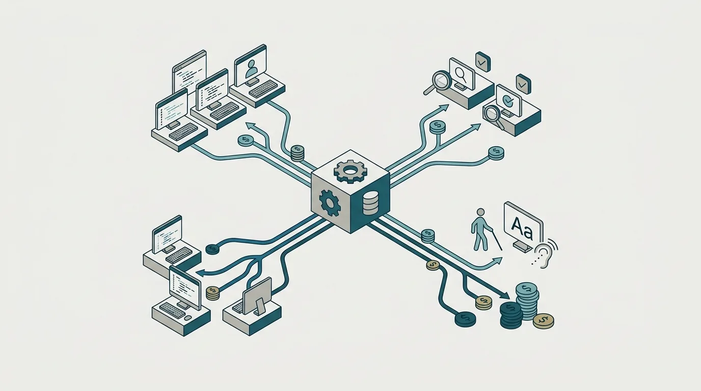
Treating design system ROI as a single number is unhelpful. The savings come from three distinct places, each with a different shape.
Component reuse and avoided build time
The largest bucket by volume. When engineers pull a <Button> off the shelf instead of building one, they skip the states, the focus rings, the disabled logic, the loading spinner, the accessibility work and the review cycle. Studies compiled by Kluver, Slack and Sparkbox suggest development teams save 31 to 47 per cent of their time when working with an established component library rather than building from scratch, and design teams gain 34 to 50 per cent efficiency (uxstalwarts.com, 2026). A separate report from autentika put the averages at 31 per cent for development and 38 per cent for design.
The numbers vary because the savings depend on how disciplined the team is about actually using the system. Ranges in the thirties and forties are plausible for a mature system with real adoption. If your team is quietly reinventing components in feature branches, you will see none of it.
QA and regression cost
The quiet one. Every component that ships with pre-tested states, accessibility hooks and defined spacing is a component that will not generate a thousand small bug tickets over the next two years. Atlassian's public metrics on their own system report a 67 per cent reduction in duplicate UI code in the first year of centralisation, and a jump in internal consistency scores from 58 to 89 per cent (saasfactor.co, 2025).
Accessibility is where this compounds fastest. GitHub's Primer system reportedly moved WCAG 2.1 AA compliance from 71 to 96 per cent after adoption. You cannot retrofit accessibility onto a thousand bespoke buttons cheaply. You can retrofit it once inside <Button>.
Single-point brand updates via tokens
The dramatic one. When a brand colour changes, updating one token cascades the change across every component, every screen and every platform. Without tokens, the same change is a manual hunt through hundreds of files, and drift starts within days.
The compounding value shows up in multi-brand and theming scenarios. One Fortune 200 company reportedly cut subsidiary brand rollout time from months to days using token overrides (uxstalwarts.com, 2026). Netguru's Silk system pushed a full rebrand through core UI in two days, with rollout in three (netguru.com, 2026). If you run more than one brand, or plan to, this alone can pay for the system.
A rough rule of thumb
If your organisation ships more than one product, supports more than one brand, or expects a rebrand in the next two years, tokens will earn their keep. If none of those are true, spend the investment somewhere else.
The W3C DTCG spec and why 2025 changed the calculus
For years, tokens were a good idea trapped in incompatible formats. Every tool spoke its own dialect. Teams maintaining multi-brand systems ended up hand-syncing dozens of token files, which is exactly the manual work tokens were supposed to eliminate.
On 28 October 2025, the Design Tokens Community Group published the first stable version of the Design Tokens Specification (2025.10). It defines a vendor-neutral JSON format for design decisions, backed by contributors from Adobe, Google, Microsoft, Meta, Figma, Salesforce and Shopify. Figma, Penpot, Sketch, Tokens Studio, Style Dictionary and Terrazzo already implement it.
One nuance worth stating plainly: this is a W3C Community Group report, not a formal W3C Standard on the standards track. In day-to-day terms that distinction rarely matters, because the tools that would need to agree on a format already have. But if procurement asks whether it is a "W3C standard", the honest answer is "stable community spec, industry-adopted, not on the standards track".
Before 2025, choosing a token tool meant partial lock-in and rewriting your token files when you switched vendors. Now, tokens are portable across tools by default. That reduces the risk of committing to a token architecture today, because the format is decoupled from any single vendor.
Tokens as AI infrastructure, not just design ops
The most significant shift in 2026 is that tokens stopped being a design project and became a platform contract. They are the shared vocabulary between designers, engineers, brand, and increasingly AI code-generation tools.
If your tokens are well-shaped, an AI coding tool asked to build a settings screen will produce something that looks like your product. If your tokens are sloppy or your components hard-code values, the same tool produces UI that lives in a stylistic uncanny valley: close to your brand but subtly wrong. That gap widens the more AI touches your codebase, and it takes senior engineering time to correct after the fact.
This reframes the investment. A token system is not just a design operations efficiency play. It is the interface AI tools use to speak your visual language. We cover this trade-off in more depth in our piece on adding AI features to your product without the hype, because the same principle applies to functional AI features: the quality of the output is bounded by the quality of the structured context you give the model.
The single highest ROI activity in a design-system overhaul is moving to W3C tokens with a three-tier architecture. Higher than rewriting components. Higher than swapping CSS-in-JS libraries. Higher than a Storybook upgrade.
The three-tier architecture referenced there is standard practice: global tokens at the base (raw values like blue-500), alias tokens in the middle (semantic names like color.action.primary), and component tokens at the top (button.primary.background). A rebrand touches only the global tier. A component tweak touches only the top tier. The middle layer decouples the two, which is what makes the whole thing survivable.
Get plain-English guides like this in your inbox.
One short email a month. WordPress, Shopify, SEO, no fluff. Unsubscribe in one click.
We never share your email.
The upfront cost is real: when a design system is not worth it
The initial build phase takes 20 to 40 per cent of design and engineering time with little visible productivity gain (uxstalwarts.com, 2026). You are paying now to be efficient later, and the executives who fund the work are usually not the ones who reap the return.
The industry ROI numbers are directionally encouraging (one study from InsArt found a 135 per cent return over five years, cited in cssauthor.com), but five-year returns do not help a team that needs to ship in six weeks.
A design system is probably not worth building yet if:
- You have one product on one platform.
- You are pre product-market-fit and your UI is a working hypothesis, not a brand.
- Your team is under about eight people total and there is no second surface on the horizon.
- You do not have someone whose job is to own the system after launch.
In those cases, a small shared components folder and a handful of CSS variables is design-system-enough. Focus on scoping an MVP that ships in weeks and revisit the question after you have something users actually pay for.
The related decision, whether to build or buy the underlying pieces, is worth thinking about explicitly. We wrote up how we approach it in build vs buy: when custom software beats off-the-shelf, and the same logic applies here: buy or fork an existing system (Radix, Chakra, Material) until you have a real reason to own one.
For teams that do meet the threshold, our digital product design work usually starts by auditing the existing UI, extracting the tokens that already exist implicitly, and rebuilding the top-used components against those tokens before touching anything else. That order is deliberate. Components without tokens end up hard-coded.
How systems fail: shadow components and governance gaps
Most ROI articles skip this bit, which is why so many design systems end up as expensive Figma files nobody uses.
Adoption fails in three predictable ways. First, developers avoid the system because it feels restrictive or because approval takes too long, so they build one-off components in feature branches. Second, the shipped components are buggy or incomplete, so teams reinvent them defensively. Third, product teams quietly duplicate components locally to dodge review, and within a year you have shadow systems living inside the codebase you built to prevent shadow systems.
The fix is governance, not more components. Someone owns the system. Contribution rules are documented and actually enforced. The system team responds to component requests inside a working week, or the pressure to bypass the system becomes irresistible. Well-documented systems can cut designer-to-developer handoff friction by around 60 per cent, but without governance they fragment into competing standards that recreate the original problem (uxstalwarts.com, 2026).
The shadow component test
Grep your codebase for hard-coded hex values and one-off <div> buttons. If you find more than a handful in code written after your system launched, you have a governance problem, not a components problem.
The tools worth knowing
The stack that works in 2026 is small.
- Style Dictionary 4 (Amazon, open source) is the standard token transformation pipeline. It reads DTCG JSON and outputs CSS, Swift, XML, JS, whatever you need.
- Tokens Studio is the Figma plugin most teams use to author tokens visually and sync them to a repo. DTCG-compatible.
- Figma Variables is Figma's native token feature. Fine for smaller systems, and now a primary handoff surface alongside Storybook.
- Supernova and Knapsack are the enterprise governance and documentation platforms. Supernova's public case studies include SoFi (100+ engineering hours saved in a quarter) and Userlane.
- Storybook 9 ships a token panel that reads your DTCG files directly, which closes the last documentation gap for engineers.
A reasonable default stack for a new system: author in Tokens Studio or Figma Variables, store DTCG JSON in the repo, transform with Style Dictionary 4, document components in Storybook 9. Boring, portable, hard to regret.
If you want to see what this looks like against real product work, see our work for examples of systems we have built for clients across web, mobile and SaaS. The pattern is consistent: tokens first, then a small set of high-traffic components, then documentation, then everything else. Any other order tends to produce a beautiful Figma file and a codebase that ignores it.