Why accessibility debt is a financial decision, not a compliance checkbox
Accessibility gets framed as an ethics topic, and it is one. But the reason it deserves board-level attention is simpler: fixing it late is expensive, and the invoice has started arriving. Research on digital product delivery consistently puts the cost of retrofitting accessibility at 10 to 30 times the cost of building it in from the start. Organisations that shift the work left spend around 67% less on compliance overall, and integrating accessibility checks into CI/CD pipelines has been shown to cut development costs by roughly 23%.
The reason is architectural. Colour tokens, component APIs, semantic HTML, keyboard focus order and ARIA relationships are decisions taken in the first weeks of a project. Change them after launch and you are not tweaking styles. You are rewriting the design system, re-authoring content and re-testing every state. Early detection keeps remediation in the 1x to 6.5x range. Late detection, once the codebase is inaccessible by default, pushes toward 100x.
What accessibility debt looks like in practice
A colour palette with 3.8:1 contrast on primary buttons. A modal built as a div with click handlers. Icon-only controls with no accessible name. Each of these is cheap to prevent, expensive to unpick after the pattern has been used 40 times across the product.
The commercial pressure has caught up with the engineering reality. Over 4,000 ADA website lawsuits were filed in the US in 2024, with a 37% surge in the first half of 2025. Average settlements sit somewhere between $25,000 and $55,000 before legal fees or remediation. That is the price of the letter, not the fix.
The regulatory floor has risen: WCAG 2.2, the EAA and ADA litigation
Three things happened in quick succession that changed what "good enough" means. WCAG 2.2 was published in October 2023 and became ISO/IEC 40500:2025. The European Accessibility Act came into force on 28 June 2025, applying to a broad range of consumer-facing digital products and services sold in the EU. And the US Department of Justice's April 2024 final rule set WCAG 2.1 Level AA as the mandatory standard for state and local government websites, with a compliance deadline of 24 April 2026 for entities serving populations of 50,000 or more.
WCAG has three conformance levels. Level A is the minimum. Level AA addresses the most common barriers and is what almost every law and procurement contract references. Level AAA is enhanced accessibility, rarely required across an entire site. AA is the target.
WCAG 2.2 adds nine new success criteria on top of 2.1, focused on motor disabilities, cognitive and learning disabilities, and low vision. Content that meets 2.2 also meets 2.1 and 2.0, so aiming at 2.2 covers you against any regulation still citing older versions. EN 301 549, the European standard underpinning EAA conformance, is expected to adopt 2.2 through 2025. There is no scenario where targeting 2.1 today is the safer choice.
POUR: the four principles that structure every design decision
Underneath the 86 criteria in WCAG 2.2 sit four principles, known as POUR. They are worth internalising because they turn a long checklist into a design vocabulary.
- Perceivable. Users must be able to perceive the information, regardless of sensory ability. Alt text on meaningful images, captions on video, sufficient contrast, text that reflows.
- Operable. Users must be able to operate the interface. Full keyboard access, no keyboard traps, generous touch targets, no content that flashes at seizure-triggering frequencies.
- Understandable. Content and behaviour must be predictable. Plain language, consistent navigation, clear form labels, useful error messages that say what went wrong and how to fix it.
- Robust. The code must work with assistive technology, now and in the future. Valid HTML, correct ARIA use, name/role/value exposed for every custom component.
WCAG is technology-agnostic. It applies whether you are shipping a static marketing site or a React SPA. The principles do not change; only the implementation details do.
Where accessibility is won or lost in the design process
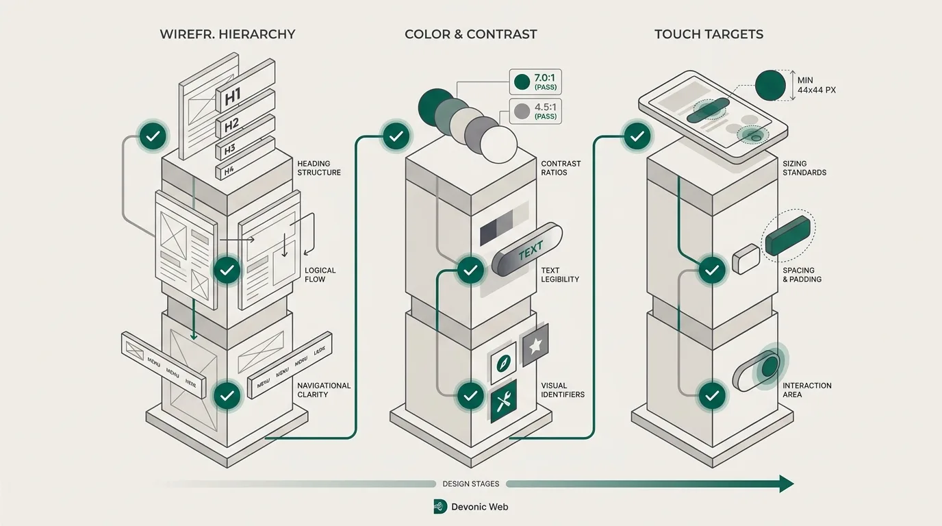
Most accessibility failures are not coding errors. They are design decisions that were never questioned. To build to AA without pain, you intervene at three points: wireframing, visual design, and component build.
Wireframing: heading hierarchy, landmark regions and focus order
A wireframe is where the document outline gets set. Every page needs one h1, a logical heading order (no jumping from h2 to h4), and clear landmark regions: header, nav, main, footer, plus aside and section where they make sense. Screen reader users navigate by these landmarks and by headings, in the same way a sighted user scans a page visually.
At this stage you also define focus order, which should follow the visual reading order. Sketch the tab path on the wireframe. If a keyboard user tabs from the logo into a promo banner, back up to the nav, then down into the hero, you have already built an accessibility bug. No amount of CSS will fix it without restructuring the DOM.
Visual design: contrast, touch targets and no-colour-only signalling
Colour contrast between text and background must be at least 4.5:1 for normal text and 3:1 for large text at AA. That constraint should be encoded in your colour tokens before the first component is designed. If your brand palette does not clear the bar, the palette is the problem, not the accessibility standard.
WCAG 2.2 introduces a minimum target size of 24 by 24 CSS pixels for pointer inputs, with exceptions. In practice, design touch targets at 44 by 44 to give yourself margin, especially on mobile navigation and form controls. And never signal state with colour alone. A required field marked only in red fails. Pair the colour with an icon, a label or a text change. This is the same discipline covered in the psychology of web design: how colour and layout shape user behaviour, where perception constraints and design choices meet.
Avoid hover-only menus. They are hostile to users with tremor or limited motor control, and they do not survive touch devices without ugly fallbacks. Click or focus-based disclosure works for everyone.
Component build: ARIA roles, keyboard traps and skip links
Every interactive component needs a name, a role and a value exposed to assistive technology. A button should be a <button>. A link should be an <a href>. Custom components (dialogs, comboboxes, tabs, disclosure widgets) should follow the WAI-ARIA Authoring Practices patterns rather than being invented from scratch.
Focus states must be visible. WCAG 2.2 tightened this with the Focus Appearance criterion, which requires focus indicators to be large enough and to contrast enough to be noticed. Removing the default browser outline without replacing it is a common, expensive mistake.
Provide a skip link as the first focusable element on the page so keyboard users can jump past the main navigation to the content. And test for keyboard traps, especially in modals, carousels and embedded third-party widgets. If a user can tab into it but not out of it without a mouse, the component is broken.
Accessibility is not a layer you paint on the surface. It is set in the wireframe, priced into the design system, and enforced in the component library.
This is the argument for investing in a proper design system. When your tokens enforce contrast, your primitives ship with focus states and ARIA baked in, and your patterns are pre-audited, every downstream product gets accessibility without additional effort. We wrote more on the economics of this in design systems: how tokens and components save money. It is also why our digital product design engagements start with tokens and component contracts before any high-fidelity screens.
Get plain-English guides like this in your inbox.
One short email a month. WordPress, Shopify, SEO, no fluff. Unsubscribe in one click.
We never share your email.
Testing that actually catches failures
No single tool catches everything. A defensible AA process combines three layers.
- Automated scans. Run Axe (or axe-core in CI), WAVE and Google Lighthouse on every route. These reliably catch missing alt text, low contrast, missing labels, invalid ARIA and duplicate IDs. They typically detect around 30 to 40% of WCAG issues, so treat the green tick as a baseline, not a certificate.
- Keyboard-only navigation. Unplug the mouse. Tab through every page. Confirm focus is always visible, focus order matches reading order, all interactive elements are reachable and operable, and no component traps focus.
- Screen reader testing. Use NVDA on Windows or VoiceOver on macOS, plus JAWS if your audience skews enterprise. Listen to how forms, error messages, modals and dynamic content are announced. This is where meaningful alt text, sensible heading order and proper ARIA relationships prove themselves or fall apart.
Wire the automated layer into CI/CD so regressions fail the build. Do the manual layers before each release and after any significant redesign. Fix Level A blockers first, then close AA gaps in order of user impact: missing alt text, keyboard traps and low contrast usually top the list.
# Example: add axe-core to Playwright end-to-end testsnpm install --save-dev @axe-core/playwrightimport { test, expect } from '@playwright/test';import AxeBuilder from '@axe-core/playwright';test('home page has no detectable WCAG A/AA violations', async ({ page }) => { await page.goto('/'); const results = await new AxeBuilder({ page }) .withTags(['wcag2a', 'wcag2aa', 'wcag22aa']) .analyze(); expect(results.violations).toEqual([]);});Why overlays do not work
At some point a vendor will pitch you a one-line JavaScript widget that promises WCAG compliance. AccessiBe, AudioEye, UserWay and their peers are the usual names. Do not buy it.
Overlays inject scripts that attempt to modify the DOM at runtime: adding ARIA attributes they cannot verify, exposing a settings panel for font size and contrast, and sometimes overriding native screen reader behaviour in ways that actively make things worse. They do not fix the underlying HTML. They cannot infer whether an image is decorative or meaningful. They cannot rewrite a keyboard trap in a third-party modal.
Overlays are cited in lawsuits, not defences against them
Numerous ADA website cases have been filed against sites that had an overlay installed. The presence of the widget did not deter the claim, because the underlying code still failed real users on real assistive technology.
Genuine conformance is boring. It looks like accessible HTML, tokenised contrast, tested components and a real audit. It does not look like a floating icon in the bottom-right corner.
Accessibility as a quality signal beyond compliance
The curb-cut effect is real. Captions help anyone in a noisy environment. Keyboard navigation helps power users. Clear labels and predictable navigation help everyone under time pressure. Achieving WCAG 2.2 AA tends to lift overall usability, not just accessibility metrics.
Structured, semantic HTML also happens to be what search engines want. Correct heading hierarchy, meaningful link text, proper landmarks and alt text are all signals used in ranking and in features like rich results. Accessibility and technical SEO share most of the same substrate, which is why we cover the overlap in our technical SEO guide.
Commercially, accessible products open procurement doors. Public sector buyers and increasingly large private-sector RFPs require documented WCAG AA conformance. In the US, 1 in 4 adults reports a disability (CDC). In the EU, the EAA now covers a large slice of consumer digital services. That is not a niche audience, it is your addressable market. Accenture's research on disability inclusion found leading companies achieved 28% higher revenue growth than peers, though that is a correlation the source itself acknowledges, not proof of cause.
If you are unsure where your current site sits against AA, the fastest way to get an honest answer is to request a free website audit. We run the automated scan, do the keyboard and screen reader passes, and give you a prioritised list of what to fix first, what can wait, and what will need to change at the design system level. Building it in from the first screen is always the cheaper path, but the second-cheapest path is knowing exactly where the debt sits before it turns into a letter.