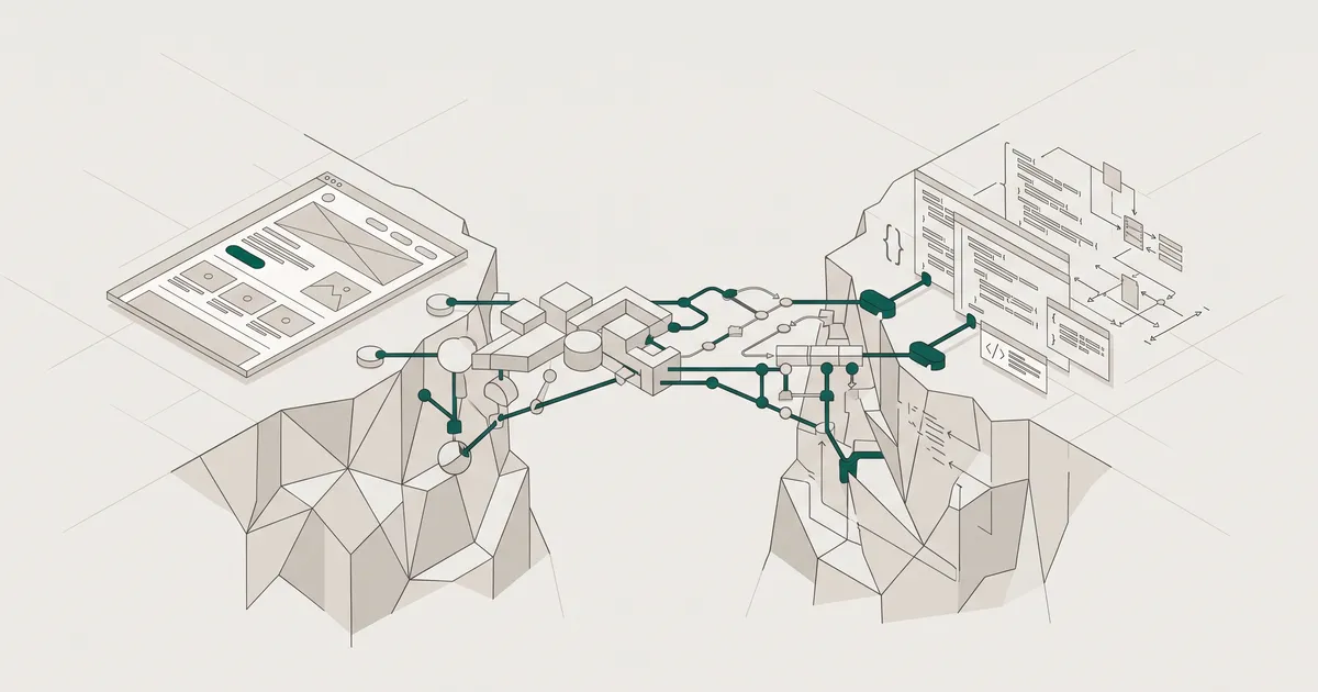
Why handoffs fail: the spec gap and the feasibility gap
Two structural gaps cause most of the pain. The spec gap is that Figma shows the happy path but not the error states, loading states, empty states, or responsive behaviour. The feasibility gap is that designers create interactions engineers cannot build as drawn.
When an engineer hits an undocumented edge case, they do one of two things: ask, which stalls the ticket, or guess, which introduces a bug the designer only spots in QA. Multiply that across a hundred components and you get the classic pattern. Designs "delivered", then weeks of back-and-forth, then a build that looks 80% right and needs another sprint to finish.
The Nielsen Norman Group frames handoff as a shared process rather than a one-way event, and that reframing matters. If the designer treats the Figma file as the artefact and the developer treats the ticket as the artefact, nobody owns the space between them. That space is where products break.
The traditional cycle is long and lossy
Designer creates mockups, writes specs, files tickets, engineer asks questions, designer clarifies, engineer builds, designer reviews, iterate. That is five or more handoff points, each of them a place where information gets lost.
What a complete handoff package actually contains
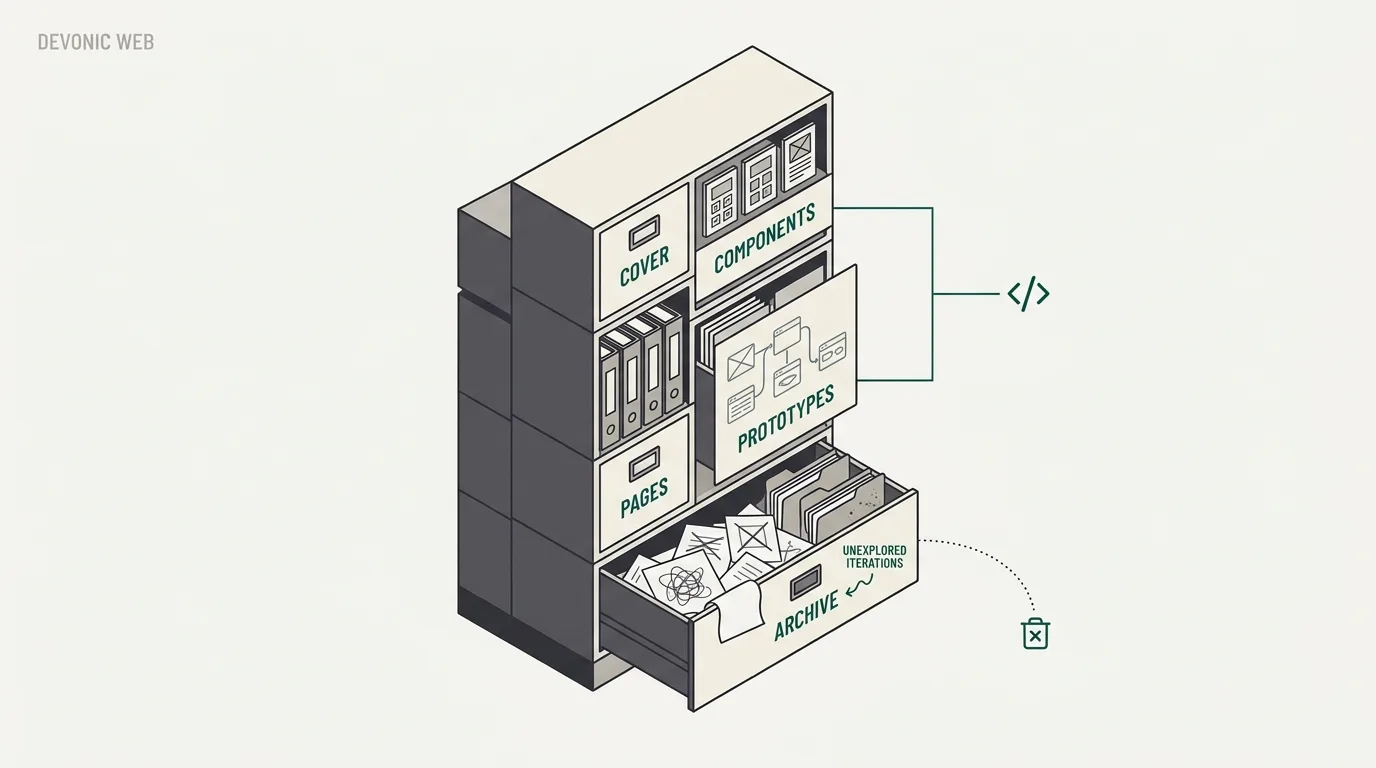
The visible screens are the smallest part of the deliverable. The strongest handoffs include four things beyond the visuals: named tokens, a states matrix, edge-case specs, and motion values. Here is how you produce those in Figma without inventing your own process from scratch.
File structure and readiness signalling
Developers land in your Figma file and see dozens of frames in various states of completion. The first job is telling them what is real. Figma's own guidance is to explicitly communicate which parts of the file are ready for implementation and which are still being explored.
A structure that works:
- Cover. Thumbnail, links to the brief, research, tickets and the component library.
- Components. The design system library used by this project.
- Pages. Production screens, one page per feature area, named by status.
- Prototypes. Interactive flows for anything non-obvious.
- Archive. Older iterations, clearly labelled so nobody builds them by accident.
"Page 1" tells a developer nothing. "Dashboard v2, ready for dev" tells them status, scope and content in five words. Do the same for frames: Checkout / Payment / Error - card declined beats Frame 47.
Layer naming, states matrix and edge cases
Consistent naming turns a Figma file into something a stranger can read. Use Button/Primary/Hover rather than Rectangle 23. Group elements that belong together. Build variants for every state rather than laying out five near-identical rectangles side by side.
The states matrix is the single deliverable that closes the spec gap. For every interactive component, document:
- Default, hover, focus, active, disabled
- Loading, empty, error
- Truncation and overflow behaviour
- Responsive breakpoints where behaviour changes, not just where things resize
Even anticipated content can behave unexpectedly under real constraints: text wrapping, undesirable line heights, truncation, user font size preferences. If you cannot show these in the design, write them down next to the component.
Motion values are the other quiet killer. If you specify "fade in" but not the duration, easing curve or trigger, three developers will build it three different ways. Include duration in milliseconds, an easing token (ease-out-quad or a cubic-bezier), and what triggers the animation.
Asset export and accessibility checks
Mark every exportable element. SVG for icons, optimised PNG or WebP for raster images, and a naming convention that will not embarrass you in a repo. Compress before you export, not after.
Accessibility should be checked in the file, not after build. Figma's native accessibility checker (added in 2024) runs contrast analysis on text and interactive elements. Run it on every page before you hand off. Catching a WCAG AA contrast failure in Figma takes a minute. Catching it after the component is built, styled and shipped takes half a day. We wrote more about this in designing for accessibility (WCAG AA) from the first screen if you want the full checklist.
Figma Dev Mode: what it solves and where it stops
Dev Mode is a developer-focused view that surfaces CSS values, spacing measurements, component properties and asset exports without giving edit access. Its biggest advantage is that it lives inside the tool designers already use. No export, no upload, no sync. The designer iterates and the developer sees it live.
For most teams, that alone closes the biggest gap: redline measurements eliminate the most common handoff questions ("what's the padding here?"), and component documentation links close the gap between design intent and implementation.
Where it stops is the code output. Figma does not claim Dev Mode generates production-ready code, and you should not treat it as if it does. The CSS is accurate for visual properties but uses hardcoded values, inline styles and no token references. A developer who copies it verbatim into a component will build something that works today and breaks the moment the brand palette changes.
Dev Mode is inspection, not generation
Treat the CSS panel as a reference for values, not a source of truth for code. Your components should still reference tokens from your design system. Otherwise you have replaced the old handoff problem with a new maintenance problem.
Code Connect and the token pipeline
Code Connect is the newer piece that starts to solve the code-output problem properly. It maps Figma components to real React (or equivalent) components in your codebase, so when a developer inspects a button in Dev Mode they see your actual <Button variant="primary"> snippet, not raw CSS.
Combined with a token pipeline, it changes the shape of the handoff. A workflow that actually works end to end:
- Design tokens live in Figma Variables (or Tokens Studio if you need the extra features).
- Tokens export to JSON via the Figma REST API or a plugin.
- Style Dictionary (or a direct Tailwind config generator) transforms the JSON into CSS variables, Tailwind config, or platform-specific formats.
- Code Connect maps components 1:1 between Figma and the codebase.
- CI runs the sync on every merge, so a token change in Figma flows to production without a developer manually editing values.
Most teams are not at step 5. That is fine. Getting to step 2 already removes the most common handoff bugs.
Design tokens as the contract between design and code
Tokens are what makes a handoff durable. Without them, the handoff is a snapshot: this button, on this day, was 12px of padding and #2B5FEA. With tokens, the handoff is a contract: this button uses space-3 padding and color-action-primary. Rebrand the product, and the contract survives.
A three-tier structure is the pattern that scales:
- Primitives. Raw values.
color-blue-600,space-4,font-size-14. - Semantic tokens. Purpose-named references to primitives.
color-action-primary,space-inset-md,font-size-body. - Component tokens. Component-specific references to semantic tokens.
button-primary-bg,card-padding,input-border-color.
The semantic layer is where the value lives. It is what your components reference, and it is what survives a rebrand or a dark-mode rollout without a component rewrite. If you have never set this up before, our piece on design systems: how tokens and components save money walks through the economics of doing it early.
Figma Variables (introduced in 2023, significantly expanded in 2024 and 2025) support colour, number, string and boolean types with mode switching for themes. For most projects, native Variables plus the REST API is now enough. Tokens Studio is still the right pick if you need a richer token model or advanced export pipelines out of the box.
Get plain-English guides like this in your inbox.
One short email a month. WordPress, Shopify, SEO, no fluff. Unsubscribe in one click.
We never share your email.
The review loop: handoff is not a one-way event
The most common mistake is waiting until designs are 100% finished before showing them to engineers. By that point, the feasibility gap is already baked in. An interaction that requires a component your framework does not support cheaply. A layout that assumes data your API cannot return in the shape the design expects. A form pattern that fails on mobile because nobody thought about the keyboard covering the submit button.
Bring developers in at wireframe review. Not to approve, to react. They will spot the constraints you missed and the opportunities you did not know existed. They also stop feeling like task-doers and start feeling like owners.
For the formal handoff, run a walkthrough call. Screen-share the Figma file, talk through the pages one by one, and invite questions. The point of the call is not to transfer information (the file does that). The point is to catch the questions the developer would otherwise sit on for two days before asking in Slack.
Designers would much rather answer a few questions now than review an incorrectly built feature later.
Airbnb and Spotify have both moved away from formal handoffs entirely, treating design and engineering as a continuous collaboration. That works when the designer and developer sit on the same product team and ship the same feature end to end. For most teams, and especially for agencies, a formal handoff gate still makes sense. The distinction is not whether to have a moment of handoff, but whether the process leading up to it was collaborative or siloed.
How this works differently for a studio shipping client work
Most handoff advice is written for in-house product teams where the designer and developer share a Slack channel and a coffee machine. In a studio context, the constraints are different and the handoff package has to work harder.
The client owns the code. The designer who ran the discovery workshops may not be the developer who ships the final release. The handoff has to stand on its own without a designer available for every ambiguous frame. That means:
- Documentation is not optional. Everything a future developer needs (states, tokens, motion, edge cases) has to live in the file or a linked doc. "Ask the designer" is not a valid answer six months from now.
- The token layer earns its keep. Clients rebrand, spin up sub-brands, and change agencies. Tokens make the design system portable. Without them, every future change is a rebuild.
- Feasibility reviews happen weekly, not at the end. We run design and build in overlapping tracks. By the time a screen is "final" in Figma, a developer has already flagged the interactions that need simplifying or the components that need a different data shape.
- The handoff package is a deliverable, not an afterthought. It gets the same review as the designs themselves.
If you are scoping a project where design and build sit with different teams (or different agencies), handoff quality decides how much of the budget goes into rework. Our note on how to scope an MVP that ships in weeks covers how we time the design and build tracks to avoid the classic "designs done, now what?" gap.
This is the kind of thinking we bake into our digital product design work, because a handoff that fails costs the client twice: once in extra build time, and again in the bugs that ship because nobody spotted the ambiguity in time.
Handoff is not the moment you throw the file over the wall. It is the record of every decision made along the way, written down so the next person can act without asking. Get that right and the build stops being a translation exercise and starts being what it should have been all along: execution.
If you want to see what this looks like on real projects, see how we work.